Impact Factor
Call For Paper
Volume 12 Issue 09
September 2026
Download Paper Format
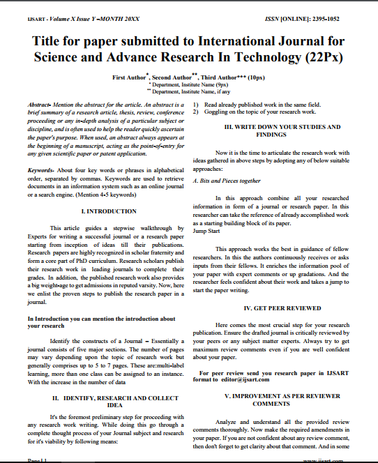
Copyright Form
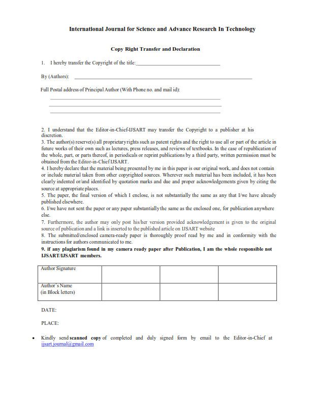

Author(s)
Abstract
This Artwork Explores The Journey Of A Global Brand Adapting Within A Local Culture, Focusing On KFC Asa Symbol Of Globalization. While The Brand Enters Diverse Markets With Its Strong Universal Identity, It Reshapes Itself According To Cultural Values In Order To Survive And Thrive. The Red And White Tones Reflect The Brand’s Global Recognition, While Local Textures, Patterns, And Earthy Colours Symbolize Tradition And Native Tastes. Their Fusion Represents The Blending Of Modernity With Heritage, Where Sharp Geometric Forms Suggest Corporate Standardization And Flowing Organic Shapes Embody Cultural Uniqueness. The Overlapping Of These Elements Highlights Negotiation And Adaptation, Creating A Central “fusion Zone” Where Global And Local Identities Meet To Form Something New. This Space Reflects Modified Menus, Local Flavors, And Cultural Acceptance While Also Hinting At The Tension Between Global Dominance And Local Traditions. Yet, Despite The Contrasts, Harmony Emerges As Both Sides Influence Each Other Equally. The Artwork Thus Emphasizes That Branding Is Not Static But Constantly Evolving, Shaped By The Dialogue Between Globalization And Localization In Everyday Life.
Keywords
Paper ID
IJSARTV11I9104032
Publication Date
September 19, 2025
Research Area
Professional Accounting